
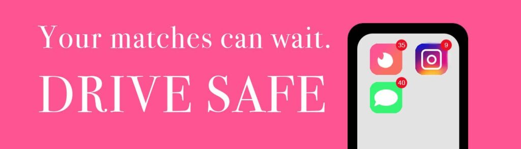
PROJECT YELLOW LIGHT
We were tasked with creating a billboard for Project Yellow Light encouraging people not to text and drive. This was my first time creating graphics on Adobe Photoshop, and I learned a lot during this process. I am proud of the fact that I created everything from scratch including the app icons. It took me some time, but I am happy with how much I learned.
For this project, I had the most difficulty coming up with a good slogan. I wanted it to be relatable, accessible and catchy. After I came up with the copy, I had a lot of fun playing around with the designs. I had never used Photoshop for graphics before, so I never realized the possibilities Photoshop offered. I was very proud of creating the iPhone and icons by myself. I also learned a lot about how important typography and white space is, especially when it comes to designing a billboard like this.
STYLE GUIDE
For this project, we learned about style guides that brands and companies use when designing websites, merchandise, social media campaigns, and anything else that has to do with a brand. My group chose to design one for our member’s vintage clothing business, Spectacle Vintage. We created a name for the brand, a color palette, typography, a brand voice and more.
I already had a little experience with Canva, but this project pushed me to think more about creating a cohesive and useful package using Canva. Creating this style guide was a fun creative endeavor. I learned a lot more about the importance of having a well-rounded typography guide and color palette, and it was fun thinking about the scenarios when you would want to use a secondary palette vs a primary palette, especially when it comes to accessibility reasons. Besides the design aspects, I liked creating the brand voice guide. There are a lot more details that go into creating a style guide than I thought before coming into this project.
Although I didn’t design the logo, I found it super cool to watch the development process, and I would love to work more with Adobe Illustrator on my own. Since downloading Illustrator for this project, I’ve practiced a little bit on the side from making a (rudimentary) logo for my dad’s company, to having fun making sticker designs for my friends. It is definitely something I want to continue learning to use.
Style Guide by Olivia WakimPROJECT TRIPLE THREAT
In this project, I worked with the same team of four others to develop a desktop website, a mobile website and an app prototype using Figma and the style guide that we created in the previous project for our brand, Spectacle Vintage.
Figma was a new platform for all of us, but it ended up being a very intuitive and easy way to create our designs. When we began this project, we had a solid style guide to work from, and we wanted to do justice to our group member’s business, Spectacle Vintage. By creating the wireframes and looking at other vintage shopping sites, we formed a solid outline for what we wanted our websites to look like. There was a little bit of a learning curve at first when we worked on discovering the function of frames, auto layouts and how to prototype, but we quickly figured out how to navigate Figma. It made working as a group super easy.
I learned how important it is to consider the design of a website, both for aesthetics and for usability. This project made me think about the functionality of other websites I like and what makes them work so well.