
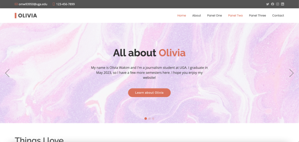
Project One
This project helped me understand what I’m actually doing instead of just copying what FreeCodeCamp told me to do. For a lot of the elements in this project, I looked at FreeCodeCamp to figure out how to do what I wanted. When I put the code into my project, I would go through and make changes so that I could personalize my project. This showed me more specifically which pieces of code affect what shows up on the page. When I was working on the animated element, I understood much better what the stylesheet connected to and how to tailor it to fit what I wanted.
I think I struggled the most with not becoming overly ambitious. There were a few times where my vision went far beyond the reality of what I knew how to do. I would start googling how to do something and try to put it into my code, but I would realize it just went beyond the scope of my abilities and I would have to delete it and start over. This was frustrating because I found it difficult to match my vision with my skillset, and I would spend a lot of time working on something that ended up failing in the end. I also found it difficult to make the page look exactly how I wanted with CSS. There were several times where I got confused with all of the different styles, especially centering objects and putting the images where I wanted them to be.
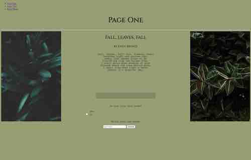
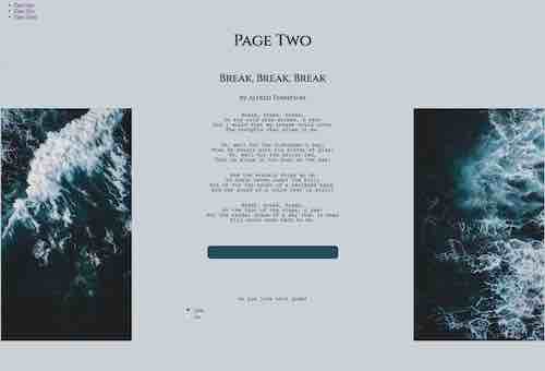
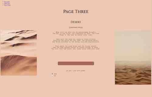
I am most proud of setting up the animated elements and organizing the page as aesthetically as I could. I played around with the animated elements to discover what parts of it I needed to include and what I could change. There were also several aspects that I googled on my own to figure out. For example, this is something small, but I was trying to figure out how to set up the poems’ stanzas without using separate paragraph tags for each line. I finally figured out that all I needed to do was add a page break tag. It’s small, but it was exciting to be able to match the page exactly how I wanted it to look in my head. I’m also proud of the colors on the page because I used an online color picker to get exact colors from the pictures I used to match the rest of the page background and fonts. Finally, I learned how to simplify my CSS stylesheet much more and I was able to combine classes and elements to make it easier to read and way less cluttered.
I really want to learn more about creating graphics and animation going forward. I wanted to be able to add a shape that looked like waves moving for the ocean page and I wanted to include leaves falling down on the leaf page, but I was having a lot of trouble figuring out how to make those shapes and animate them. I would also love to learn more about layouts and putting photos in columns and making more detailed aesthetic changes. Finally, I want to learn about databases because when I created the text box with a “write your own poem” demand, I couldn’t figure out how to link it to a database, so you can’t actually submit anything.
Project Two
Bootstrap allowed me to learn how to set up columns and grids in a way that looks much more like a website than my html website. Some of the most exciting things I learned were how to put pictures in columns and how to align them the way I want, which was something I struggled with a lot last unit. When you first introduced us to Bootstrap, I was honestly very confused about it, but over the course of the unit I understand it much better and I am way more confident in my ability to create a web page with it. I like it more than html now.
I remember being very confused about Bootstrap when we made the Valentine. It was confusing for me to go from html where I didn’t use classes as much to Bootstrap where classes can make changes without even putting them on a style sheet. I think that was my biggest struggle to understand, but I practiced on my own until I understood it better. I also struggled with figuring out padding and margins.
I’m proud of the learn more section on the page. I didn’t like how the paragraphs looked when they were all left out, and after looking through the Bootstrap page I figured out how to make it look neater and cleaner. I’m also proud of how I changed the default button color including the hover state because that took me a while to figure out.
I want to keep learning about how to set up Bootstrap pages from scratch. I think I need more practice with getting it set up and customized without the templates because it’s easy to forget how. I also want to learn more about all of the functions Bootstrap offers because I feel like there are a lot of things I still don’t know.
Being able to create a professional website without starting from scratch is super helpful and I’m glad I learned how to do this. My dad wants me to make him a website for his financial planning business, so I feel like this is another step towards being able to do that successfully. I learned how to read the template and make specific changes as well.
I struggled a bit with figuring out which part of the template I wanted to make changes to. It’s a lot of code to read and sort through, and on first glance it can be really overwhelming.
I’m proud of setting up the pagination or the slider with photos of my own and I’m proud of adding a second one so that they would match both my likes and dislikes.
I’d love to keep learning about the different templates and how to make more detailed changes, especially when it comes to editing elements that were made in Illustrator because my template didn’t give me the chance to do that.
I learned how to really edit the custom css in Bootstrap which, as I mentioned above, was very confusing to me when we started this unit. It makes a lot more sense now and I really appreciate how this project helped to clarify that and break it down. I also learned how to use the inspect tool in a useful way. Before this, I’ve always been super confused about why anyone would need it or how to even read it, but it makes much more sense now.
I struggled with making sure the colors were all changed and matching. I kept going back only to realize there were a few spots with hover states that still looked wrong, and I wanted to make sure my new fonts looked right and matched the rest of the page. It was tedious, but I think I caught them all.
I’m really proud of how I customized the website exactly how I wanted it. At first, inspecting the website and making changes looked really overwhelming and confusing, but as I continued to work with it I realized how convenient it is and I feel like I can apply that to a lot of different situations in the future. I’m proud of incorporating new fonts that I actually like onto the webpage and putting in customized icons. Overall, I’m proud of the way the website turned out.
I am very excited to learn about databases and how that works. I want to keep learning how to make more interactive websites that you might even sell something on. I also would be interested in learning about how to add custom logos and designs into a website. I want to be able to make a site for my dad’s business after this class ends, so I’m excited to keep adding more skills.
Project Three
I learned a lot about how important choosing the right theme is. I tried out several different themes and a few plug-ins before I landed on the right one. A lot of the other themes were very confusing and made it difficult to add my own touches later on. I also learned about the limitations of WordPress in terms of not being able to customize the html. On the other hand, I understand why it’s such a great content management system because creating a news site from scratch would be so much more labor intensive, especially when it comes to the media libraries.
I struggled with customizing this theme and the news site. I was satisfied with the fonts and colors that the theme came with, but there were a few elements I couldn’t figure out how to change quite the way I wanted it. It took me a while to figure out how to remove the category descriptions from the menu. I also had a difficult time working through two of the themes I used before this. On one of the themes, none of the extra blocks I added would show up which was very frustrating.
I’m proud of finally achieving the look and funciton that I envisioned. It was frustrating at times to keep having to try new themes, but I was able to figure out some things on my own like how to remove the category descriptions, how to customize the website and add a section for videos and how to use custom CSS with WordPress.
I’d like to see if there’s a way to edit the HTML to create even more flexibility. I didn’t want to go in and accidentally mess something up, but in the future if I build another WordPress website I’d like to continue looking for more options.
The e-commerce website was very cool to make and I learned how powerful plug-ins are. The WooCommerce theme was very easy to work with and to customize and I feel like I just scratched the surface of what you can do with WordPress e-commerce. I learned a lot about custom CSS in WordPress through this project. Custom CSS is like the extra icing on the cake to be able to make WordPress elements look exactly the way I want them to. I wish I had my own business so I could create a full website.
I struggled with figuring out additional extras and plug-ins to include in this website. I wish I had shopped around more to see what else I could have added. I also wish I could add more visuals and videos to the products like a 3D perspective of it, but I’m not sure how to go about doing that without actual products to use.
I’m proud of how much I customized the page and the review plug-in. I think it matches with what I imagined in my head and I think it really added to the e-commerce page. I also liked using the extra plug-in to add the FAQ section on each product. On hyaluronic acid I added more tabs like I would want to use on a real website. Although I didn’t have much use for it in this scenario, it would be a great addition to clothing websites and other places where you need long descriptions. I also liked being able to find the option to leave reviews.
I would like to continue learning about the different plug-ins that can add to WordPress websites. I also would have liked to look around more at different e-commerce themes.
Final Project
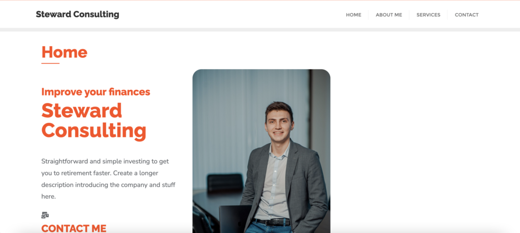
For my final project, I chose to create a website for my dad’s new business, Steward Consulting. He has always wanted to work as a financial consultant, and now that he is retired he has the chance to do so. He doesn’t want to work too much since this is more of a realization of a hobby rather than a way to pay his bills. When we had our initial discussion about the project, he sent me a few websites he already liked and described the functions he wanted the site to fulfill. He wanted it to have all the information he sent me in a powerpoint about his services, the process and his background. He didn’t need there to be a way to form an account because he wants to handle most of that outside of the website, and he didn’t want to include any payment information on the website yet.
Since he is still working on figuring out how he wants to manage a lot of the business, there are certain aspects that he hasn’t fleshed out, like the payment and pricing information and a few of the more technical pages like privacy policy and disclaimer pages. We have plans to continue working on it over the summer.
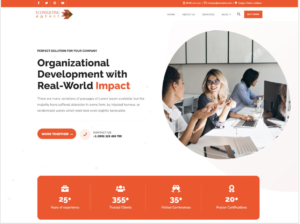
I began the process by searching for a theme that I liked. I found one called e-consulting agency. I liked the pre-developed homepage a lot, and I spent some time editing it to make it look the way I wanted. I quickly realized that it was much too restrictive and did not achieve what I wanted. Before abandoning the homepage, I decided to work on creating my own page that adopted some of the same elements. The hardest part of this project has probably been fixing the details from my own page to look similar to the theme’s page. This is what the theme looked like:
I liked how the top of the page looked and the middle had a great services section and next steps. My goals were to create a services area that had boxes that moved when you hovered over them. I spent the most time working on the homepage and the CSS. This project taught me so much more about plugins and how much more flexibility there is in WordPress than I initially thought.
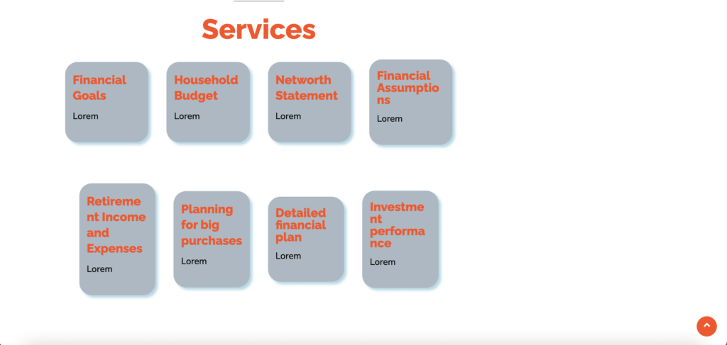
Here is how the homepage and the services boxes started out.
I had so much trouble figuring out how to make the icons work. I found a plugin for Font Awesome which I was very happy about. This allowed me to add a lot more icons to the rest of the page and made it a lot more visually interesting. I also customized the icons through CSS so that they were larger, centered, and a different color.
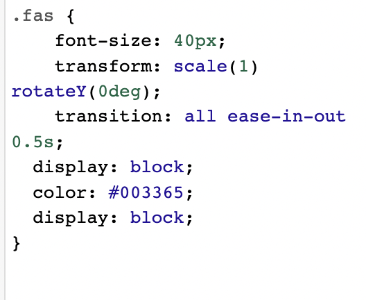
That took some frustration and an hour or two to figure out. The icons were surprisingly one of the most difficult parts of this project, but I really wanted to include them. For the services boxes, I learned how to add a drop shadow and round the corners using CSS. I also found a plugin that allowed me to add super basic animation to different blocks, so now when you hover over one of the services box it grows.
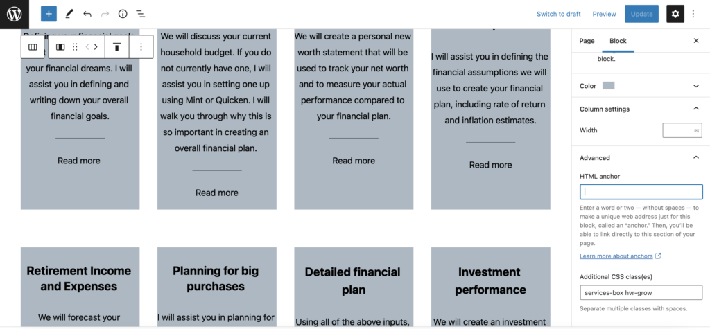
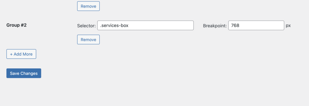
All I had to do was paste the CSS class in the additional CSS classes box as pictured above. Another item I struggled with was making all of the service boxes the same size regardless of the amount of text inside of them. This took me a while to figure out, but I finally found a plugin (big surprise) that made this process very simple. They went from looking very uneven, to looking like this:
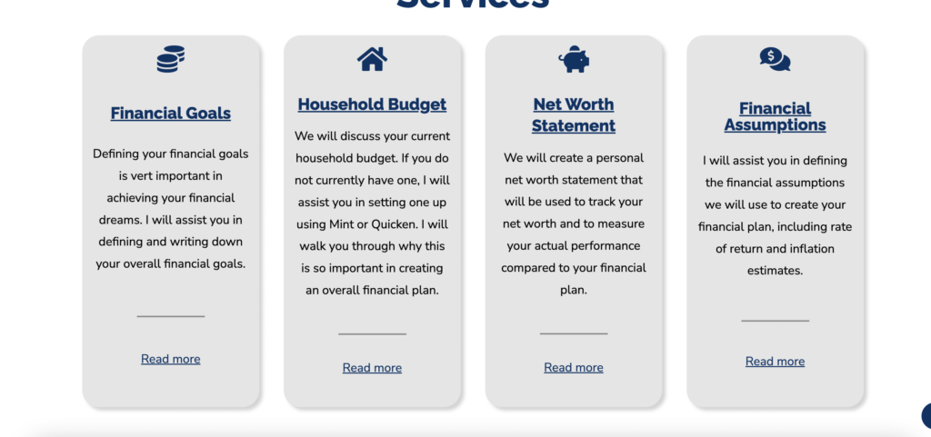
I just had to target the custom class I gave them and now it looks so much better.
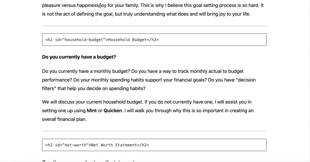
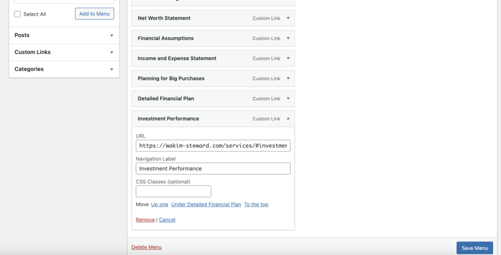
I am also proud of making links within a page. After some googling, I realized that it was pretty easy to link to headers on the page, and I made the services page much easier to use. Over the summer as my dad expands on his business, I would like to add to those sections.
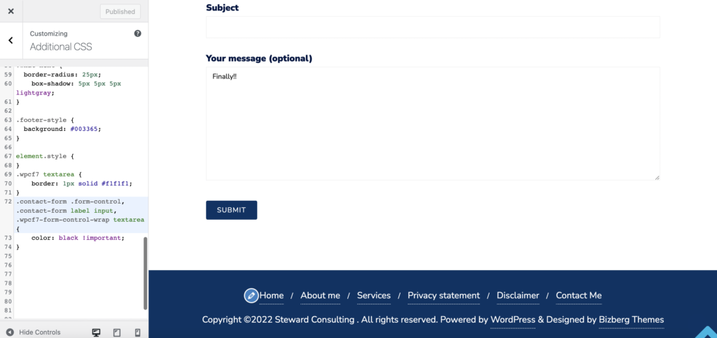
I also ran into a problem with the contact form where the font was coming out white in the message box, so you couldn’t see what you were typing. This took me a frustrating amount of time to figure out, but I managed to change it to black by using the !important demarcation.
Finally, although this doesn’t specifically relate to 4110, I created my dad a (rudimentary) logo with Illustrator that I hope to improve. I was able to add it to the tab bar so that it now looks like this.
Overall, I think a lot of what I learned and struggled with pertained to the customization and appearance of the website. I am very happy with what I learned and although there is more that I want to work on over the summer as his business develops, I am excited about what I learned. Going into this project, WordPress was my least favorite area that we learned this semester. I didn’t understand how to customize it and I thought it was very limiting. Now, my opinion has changed a lot, and I can see the practical uses a lot more. I became much more familiar with plugins and custom CSS, and I am excited to continue learning about it on my own.